'%3E%3C/circle%3E%3C/g%3E%3C/svg%3E)
UK cartogram round-up
We've been making hex cartograms since 2017. We made a hex layout for the 2010 UK Parliamentary Constituencies and, last year, a hex layout for the 2024 UK Parliamentary Constituencies. We make our layouts openly available, licensed, and easy to modify. Despite that, many others have also gone to the effort of designing layouts to add their own stamp on things. Now that the dust has settled, this post is a round-up of some subjective thoughts on the varied cartograms that were used in the recent UK General Election.


First some thoughts on cartogram layouts. When we designed our layout we tried to follow some defined rules.
- Large scale geography. Try to maintain the overall shape of the country and large scale recognisable features e.g. East Anglia, Cardigan Bay, estuaries (Thames, Humber, Forth, Bristol Channel), and keep islands as islands (Ynys Môn, Orkney/Shetland, Isle of Wight, Na h-Eileanan an Iar). We also keep Lough Neagh as it is a useful feature within Northern Ireland.
- Regions/nations. Keep the nations and regions as coherent blocks and try to maintain the correct relationships between those blocks. For example, the South East should wrap up around London keeping it separate from the East Midlands. The East of England shouldn't border the West Midlands.
- Compass directions. We try to make sure that any constituencies with compass directions in their names (e.g. Leeds North West, Leeds North East, Leeds West and Pudsey, Leeds South, Leeds Central and Headingley, Leeds East) are kept in roughly the correct
orientation relative to each other even if we can't preserve quite the correct rotation.
- Coasts. It isn't always possible to keep coastal constituencies on-the-coast but they should at least be arranged in coastal order.
Reviews
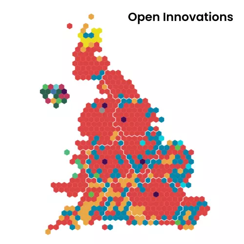
Open Innovations

Credit: Open Innovations
We're biased so we like out layout. We've preserved a lot of coastal features including Cumbria, The Wash, the Bristol Channel, the Humber Estuary, and Norfolk. But we know that other people may know parts of the country much better than us. So, if you don't like some aspects of it, we'd love for you to try re-arranging hexes and send us an updated HexJSON file.
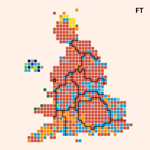
Financial Times

Credit: FT
Unlike most others in this review, the Financial Times have gone with a square-based cartogram. Using squares gives fewer neighbour options but they've made a pretty reasonable attempt. There are some nice touches like the shape of Wales and positioning of Ynys Môn (Anglesey); they've kept islands as islands. They've done a pretty good job of the coastal constituencies and I like the little nod to Beachy Head on the south coast. They seem to have made sure that compass-direction constituencies (e.g. Bristol South, Bristol North East, Bristol North West, Bristol Central, Bristol East) are sensibly arranged even if they are sometimes on a bit of an angle. However their East of England region touches up against the West Midlands. The coast of Norfolk is less than ideal and the end of Cornwall looks a bit blocky too.
In terms of styling, the black region boundaries are a bit strong but the thin boundaries around the squares match the standard FT background and work well.
Parliament/Automatic Knowledge

Credit: UK Parliament/Automatic Knowledge
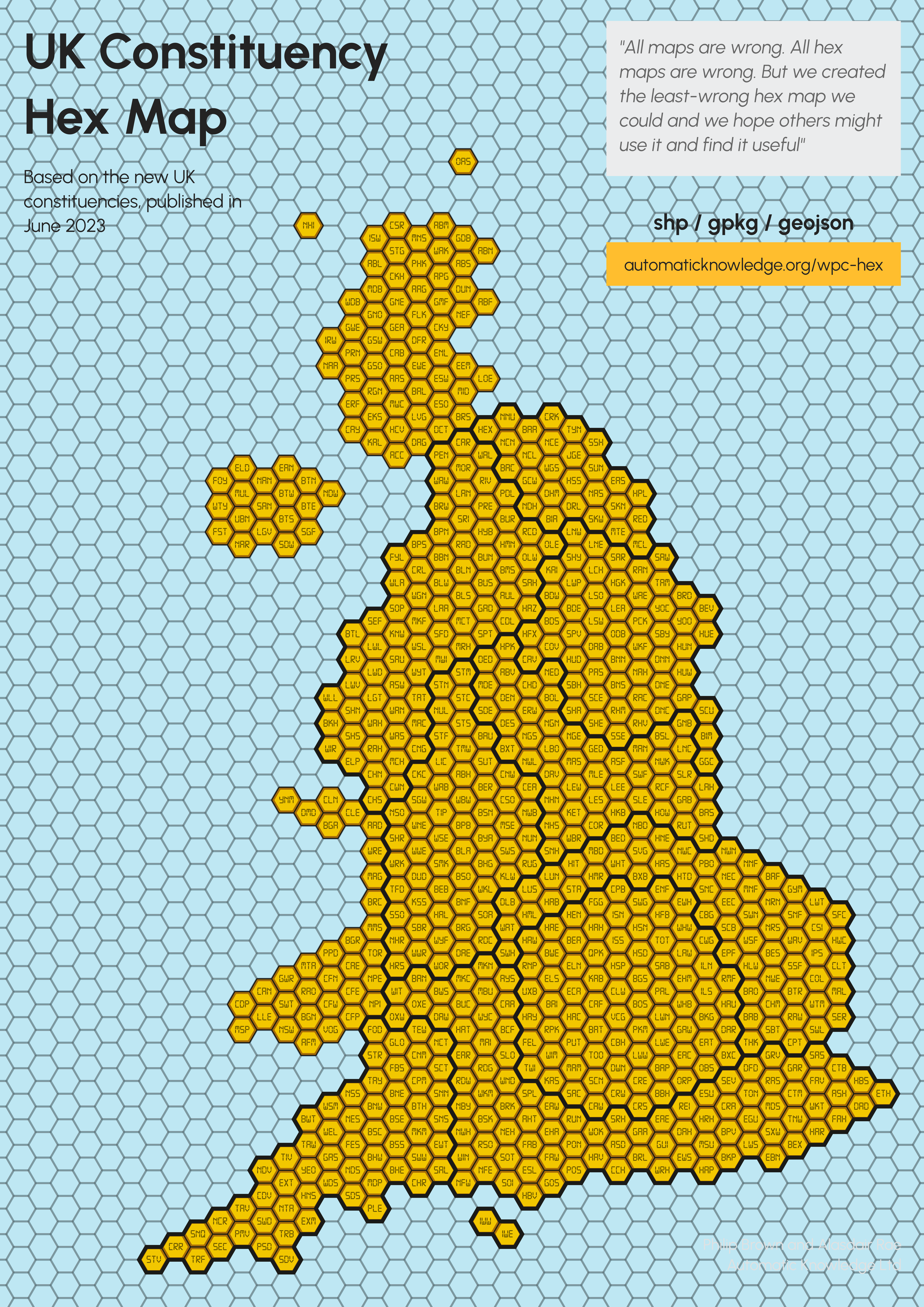
Next up is Alasdair Rae's hex layout (2023) as used on the UK Parliament's Election Results site. Alasdair says:
All maps are wrong. All hex maps are wrong. But we created the least-wrong hex map we could and we hope others might use it and find it useful.
Given how narrow the Menai Strait is, they've taken the decision to join Ynys Môn (Anglesey) onto the mainland. Unfortunately that loses the Llŷn Peninsula. They've closed up the Bristol Channel before Newport. They've brought most of North Yorkshire down to the east of Leeds leading to the line of blue being diagonal. As with the FT, they've got the north coast of Norfolk on a slope. The version on the Parliament website doesn't have nation/region boundaries but they are shown on Alasdair's Blockbuster's graphic. So we can see that the East of England gets quite far west and significantly pushes up against the West Midlands.
In terms of styling, there are no nation/region boundaries and the individual hex borders are kept very thin so it is easy to get the correct overall impression of the election results.
Sky News

Credit: Sky News
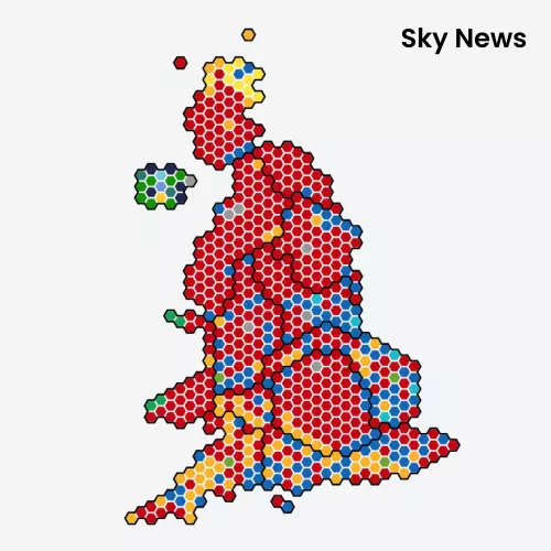
Sky News seem to have used Alasdair Rae's layout as a base and then made some changes. They seem to have mostly re-arranged bits of the South West, South East and London by dragging some constituencies east. This makes Kent stick out a bit more but leaves Stroud sticking out into the Bristol Channel.
In terms of styling, the black nation/region boundaries are quite strong. Together with the light hex boundaries they end up "bleeding out" a bit visually which makes it a bit harder to read hex colours on boundaries.
BBC News

Credit: BBC
The BBC have almost entirely used Alastair's layout. One change I notice is that they have separated Ynys Môn (Anglesey) from the mainland. I think this helps give some shape back to the Llŷn Peninsula.
Visually, the whole map is a bit washed out with very dominant boundaries. The boundaries pull the eye but otherwise the map is easy to read.
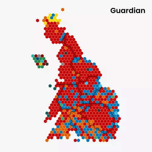
The Guardian

Credit: The Guardian
The Guardian have gone to the effort of making an entirely original design. On a positive note, they make sure the South East joins up to the East of England so points for that. They've also kept North Yorkshire on the top side of Yorkshire and the Humber. They've managed to recreate some of the shape of the east of Scotland. Despite these positives, the overall look of the country isn't nice. For some reason Wales seems to be wilting; I'm sure they could have pulled up Pembrokeshire and the Gower without changing neighbours much. Also, the South East drops to the same level as the southern-most point of Cornwall.
In terms of styling, the region and individual hex boundaries are better than some of the others as they don't affect the overall impression of the results. The country looks a bit wilted though.
The Hindu

Credit: The Hindu
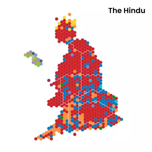
Like The Guardian, The Hindu went to the effort of making their own layout. They've also managed to avoid the East of England jutting up against the West Midlands so points for that. They've kept Ynys Môn (Anglesey) as an island. They've made some very different choices about the layout of Northern Ireland. However, within regions they've placed hexagons very badly.
That hex that looks like the Isle of Wight is actually Hove and Portslade. They've put Isle of Wight East up near Birmingham and Isle of Wight East inland from Brighton. They have Bristol inverted; Bristol South is on the top with Bristol North East and Bristol North West on the bottom. Similarly Leeds South and Leeds South West and Morley are north of Leeds Central and Leeds West and Pusdey is far to the east. They've put Richmond and Northallerton on the southern boundary of Yorkshire and the Humber despite it being on the northernmost side of Yorkshire. It is almost as if they've deliberately gone out of their way to invert south/north.
Style-wise, it makes some similar choices to ours with thin white lines for nation/region boundaries.
YouGov

Credit: YouGov
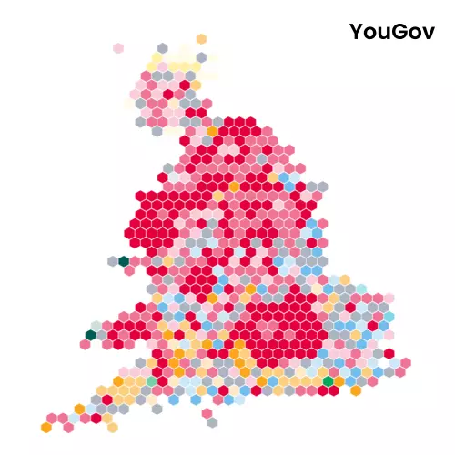
Another custom layout, this time from YouGov. The overall shape of the country looks pretty good although they've decided to omit Northern Ireland entirely. They don't have any region/borders so it isn't easy to see how regions are arranged. But there is some poor positioning. For instance they have Milton Keynes Central far across to the west, Leeds North West touching Darlington, and North Yorkshire pushed down and to the east.
Bloomberg

Credit: Bloomberg
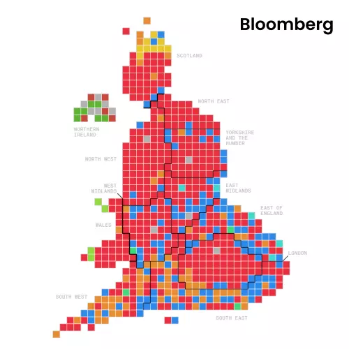
Like the FT, Bloomberg have gone with a square-based map. I think they've done a pretty good job of it even if the south east of England is very rounded. They've avoided the East of England touching the West Midlands. They've done a good job in Yorkshire keeping North Yorkshire at the top. Like the FT they've taken advantage of the square layout to have Ynys Môn (Anglesey) just touching via a corner.
Style-wise they've kept the nation/region boundaries from dominating.
Final thoughts
Firstly, kudos to everyone who has created a layout of the 650 UK Parliamentary constituencies. It takes a lot of effort and hard decisions to design.
Most have done a good job of compass-direction constituencies (but not The Hindu). Many have the East of England pushing up against the West Midlands which is a shame. There are some nice little touches here and there.
Obviously we have a bias towards our layout. But, of the others, here's our highly subjective ranking based on a combination of overall impression, details of the layout, and the ease of reading:
- Parliament - the most legible
- Bloomberg - they've done a good job with layout
- Financial Times - the shape of the country is pleasing but the region boundaries are a bit strong
- BBC - a bit washed out and dominated by agressive region boundaries
- Sky News - the aggressive black region boundaries and thick hex borders make it harder to read
- Guardian - although there some good points in the layout, the overall look of the country isn't great
- YouGov - good overall shape but they've omitted Northern Ireland and the positioning of some constituencies is way off
- The Hindu - the arrangement of constituencies within regions is a total mess
You can find our constituency layouts and other UK geographies (MSOAs, Local Authority Districts, NHS England PCNs etc) on our hexmap.uk/layouts site where each is available to download in HexJSON/GeoJSON/SVG.