'%3E%3C/circle%3E%3C/g%3E%3C/svg%3E)
Tracking the buses

Does your bus journey take longer than the timetable says on your commute to/from work? Do you want to know the best time of day to avoid long journeys? Do you wish you had evidence to back up your suspicions about slow bus routes? Well, with our new bus tracking tool, you can.
Tracking every bus in England
Our story starts back in September whilst working on a project with Liverpool City Region. We collected the live feed from the Bus Open Data Service (BODS) every minute for 10 days. This live feed reports the location of every bus in England (except London). At around 1.6MB per minute we ended up with around 24.7GB of raw data.
Our goal was to create “real” versions of the bus timetables to see how well buses performed relative to the schedule. This "real timetable" would be based on when buses actually arrived at stops, rather than when they were supposed to arrive.
To help us explore all this data, we started building a tool to visualise it. This felt like a good idea for several reasons: we wanted to recreate some of the charts in our earlier work on buses; visualising the data makes it easier to debug; we thought that others might also be interested in a tool that let them easily check the performance of their own bus route.
The tool
The tool lets you pick any bus route in the North West and Yorkshire & the Humber. You then select any pair of bus stops on the route (that you can travel between on a bus). We then show every timetabled journey time, between those stops, that appeared in the BODS data. You can change the view to see all days, week days, or weekends only. For the statisticians, there is a box and whisker plot to compare the distribution of journey times between the selected stops.
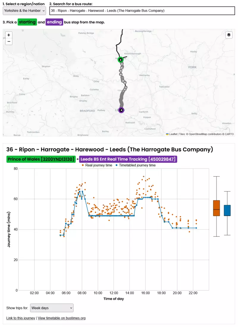
Credit: Open Innovations / BODS
The details
The Bus Open Data Service reports the details, including the position, of every bus in England (except London) every ten seconds. Like all data, it is not perfect.
Buses don't always report their GPS locations. Sometimes a bus doesn't send GPS locations for part of its journey. We tried to improve the reliability of the data when it made sense to do so. For example, if there were no GPS reading at a particular stop, but there were GPS readings for bus stops before and after, we estimated a time for the stop in question. These estimated times are indicated on the tool.
We have built the tool around service numbers because this is what we, as bus passengers, are used to. But it turns out that bus routes can have lots of complexity. Some services can have multiple variations of parts of their route meaning that not all bus stops are part of every journey. Just be aware of that extra complication.
Sometimes, journeys can appear to have very slow or very fast as-the-crow-flies speeds (under 1km/h and above 100km/h). Having looked at some of these in detail, they seem to occur when the raw data carries on reporting an old stop sequence number after a period of no updates. We don't know if they are incorrectly reported by individual buses or something going wrong within BODS but, either way, these sorts of inaccuracies are out of our control.
We don’t know anything about cancelled or diverted bus services. Whilst it is possible to report this in the raw location data, we didn’t see any cancelled service information in the 10 days of data that we collected.
On some routes we may be missing initial or final stops. This happens when there are no GPS readings at these stops, so we haven't been able to interpolate times for them.
More frequent GPS positions from buses would help reduce many of these problems.
Overall, BODS isn’t perfect, but it exists, is open, and we have been able to use the data to make something new. We have lots of suggestions and ideas for how we can improve BODS.
Final thoughts
An important thing to keep in mind is that congestion is not the fault of buses or bus companies. Given that there is always some amount of uncertainty in arrival times of buses, we would argue that it’s preferential for buses to turn up slightly late, rather than slightly early. This avoids passengers missing buses or sitting on a stationary bus, which, from personal experience, is frustrating; most people like to feel that they are moving rather than waiting around.
An intuitive reaction to unreliable buses may be to drive your own car instead. However, the more people that use buses, the more reliable they will be, since less road space would be occupied by cars, and the better traffic would flow. Think of it like this: you don’t get stuck in traffic - you are the traffic!
What's next?
This is just the first version - we want you to use the tool and share it widely. We hope that it demonstrates some of the limitations of BODS as well as the potential if the source data were improved.
If you have any feedback or spot a bug (not a late bus - we don't control the buses), you could raise an issue or email us. We can’t guess all the ways that this might be useful, so we’d love for you to get in touch to tell us how you’re using it and to help us figure out what to do next.
We know that we can repeat this work for more regions of the UK and beyond. There’s lots of interesting analysis we can do using this data (and new data in the future) to better understand our cities and economies. Help us decide what to do next.